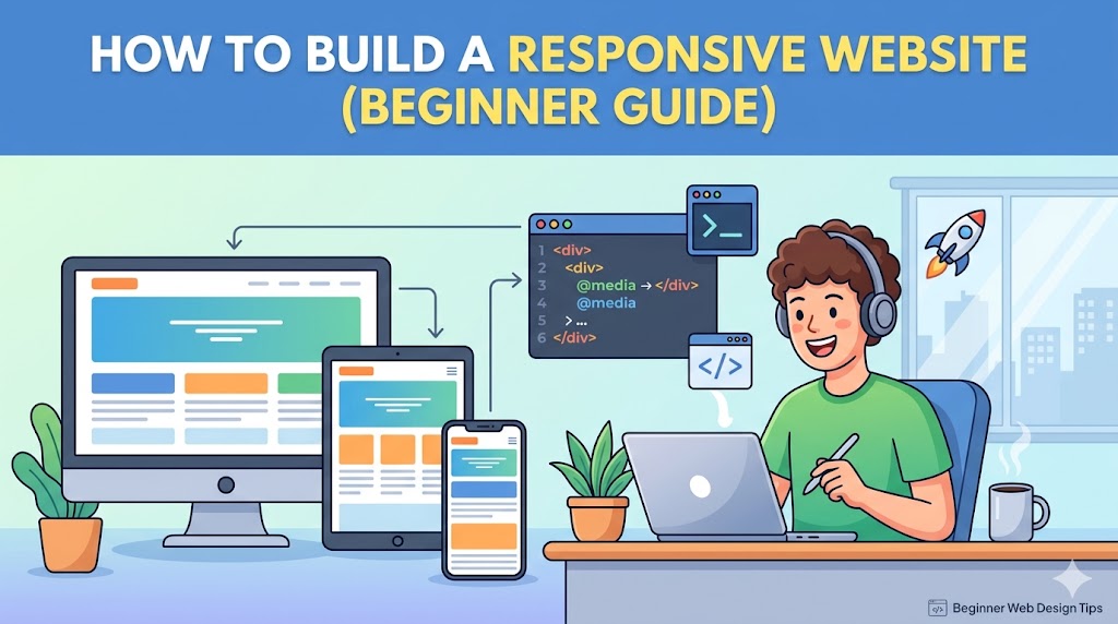
No one browses the web anymore on just desktop computers. Now people visit your site on smartphones, tablets, notebooks, wide-screen monitors, and all kinds of other screens in between. Your site needs to look good everywhere, or people won’t stay around—and neither will the search engines.
This is where responsive design comes in.
In this introductory course, you will discover the process for designing a responsive website from start to finish.
What Is a Responsive Website?
A responsive website automatically adjusts its layout and content to fit different screen sizes.
A responsive site should:
- Look good on mobile devices
- Adapt to tablets and desktops
- Ensure text is easily readable
- Offer accessible navigation
* This creates an enjoyable experience across platforms.
Why Responsive Design Matters
Responsive design improves:
- User experience
- SEO rankings
- Mobile usability
- Conversion rates
Without responsiveness:
- Users zoom excessively
- Buttons become hard to click
- Layouts break on small screens
* Poor mobile experiences drive visitors away fast.
Step 1: Start with a Mobile-First Mindset
Instead of designing only for desktops:
* Design for smaller screens first.
Why this works:
- Forces cleaner layouts
- Improves performance
- Prioritizes essential content
Step 2: Use Flexible Layouts
Avoid fixed-width layouts.
Bad Example:
.container {
  width: 1200px;
}
Better Example:
.container {
  width: 100%;
  max-width: 1200px;
}
* Flexible layouts adapt naturally to different screens.
Step 3: Use CSS Media Queries
Media queries allow your layout to change based on screen size.
Example:
@media (max-width: 768px) {
  .menu {
    flex-direction: column;
  }
}
* This is one of the core techniques behind responsive design.
Step 4: Optimize Images for Different Devices
Large images can ruin mobile performance.
Best practices:
- Compress images
- Use responsive image sizes
- Enable lazy loading
Example:
<img src="image.webp" loading="lazy" alt="responsive image">
* Faster websites improve both UX and SEO.
Step 5: Build Responsive Navigation Menus
Navigation should work smoothly on smaller screens.
Common mobile solutions:
- Hamburger menus
- Sticky navigation
- Simplified menus
* Complicated navigation hurts usability on mobile devices.
Step 6: Use Relative Units Instead of Fixed Pixels
Relative units scale better across devices.
Better options:
%emremvw
Example:
h1 {
  font-size: 2rem;
}
* Relative sizing creates more adaptable layouts.
Step 7: Make Buttons Mobile-Friendly
Small buttons frustrate users on touch devices.
Good mobile buttons should:
- Be large enough to tap easily
- Have proper spacing
- Use readable text
Example:
<button class="cta-btn">Get Started</button>
* Mobile usability directly impacts conversions.
Step 8: Test on Real Devices
A website may look perfect in a browser preview but fail on actual devices.
Always test:
- Smartphones
- Tablets
- Different browsers
* Real-world testing catches issues early.
Step 9: Improve Website Performance
Responsive design also includes performance optimization.
Focus on:
- Fast loading speed
- Lightweight assets
- Reduced JavaScript bloat
* Mobile users expect fast experiences.
Step 10: Avoid Common Responsive Design Mistakes
1. Using Large Fixed Elements
They break layouts on small screens.
2. Ignoring Mobile Typography
Tiny text kills readability.
3. Too Many Popups
Popups are especially annoying on mobile.
4. Overcomplicated Layouts
Simple layouts usually perform better.
Real-World Responsive Design Example
Desktop Version:
- Multi-column layout
- Larger images
- Expanded navigation
Mobile Version:
- Single-column layout
- Smaller optimized images
- Collapsible menu
* Same content, optimized differently for usability.
Why Google Prioritizes Responsive Websites
Google uses mobile-first indexing.
That means:
* Google primarily evaluates the mobile version of your site.
Responsive design helps:
- SEO rankings
- Mobile usability scores
- Core Web Vitals
Beginner-Friendly Responsive Design Tips
- Keep layouts simple
- Prioritize readability
- Reduce clutter
- Focus on usability first
* Great responsive websites feel effortless to use.
FAQ
What is responsive web design?
Responsive design allows websites to adapt automatically to different screen sizes and devices.
Why is responsive design important?
It improves mobile usability, SEO, and overall user experience.
Do I need coding skills to build a responsive website?
Basic HTML and CSS knowledge helps, but many modern website builders also support responsive design tools.
Summary
Responsive design is no longer optional—it’s expected.
Key takeaway:
- Flexible layouts
- Mobile-first design
- Optimized images
- Real-device testing
* These fundamentals create websites that work beautifully across all devices.
Get Started
Start improving your website today:
- Test your site on mobile devices
- Fix layout issues with flexible design
- Optimize images and navigation
- Prioritize speed and usability
* Small responsive improvements can dramatically improve user experience and SEO performance.
Build a responsive website that looks great everywhere and keeps users engaged