

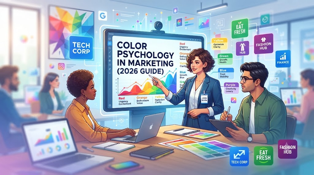
Have you noticed that fast-food companies usually use the color combination of red and yellow? Or maybe you have noticed how banks use the color blue or how luxury products use the color of black and gold? All of these color combinations and schemes are not accidental at all. There is always a well-planned color strategy behind every successful company that aims to influence the feelings and thoughts of the customers.
Color psychology has been one of the most precious assets of modern marketing. Although excellent goods and services will always remain the foundation of every company, the colors that it uses in its branding, website, advertising materials, or packaging will create an impression before the customer will even read the description of the product or service.
In this article, you will learn about the basics of color psychology in marketing, the meanings of different colors, the color scheme selection tips, and some mistakes that should be avoided in the process.
What Is Color Psychology?
Color psychology refers to the process of studying how different colors affect human perception, behavior, and emotions. In marketing, it assists in conveying visual messages prior to any interaction with goods and services.
For instance, whenever someone opens a website, he or she will likely form a certain impression about it in a matter of seconds. During those seconds, colors will make a great impact on the formation of that impression. A clean blue website may be perceived as a trustworthy and professional website, while a bright orange call-to-action button will generate excitement.
However, it should be noted that colors do not always have the same meaning. Factors like culture, age, personal experience, and even business sector influence the way people perceive colors. Still, some of them are widely known and effective for marketing purposes.
Why Color Psychology Matters in Marketing
Imagine walking into two stores that sell similar products. One feels bright, organized, and welcoming, while the other feels dull and cluttered. Even before speaking to anyone, you’ve already formed an opinion.
The same thing happens online.
Color psychology affects:
- Brand recognition
- Customer trust
- Purchase decisions
- Website engagement
- Click-through rates
- User experience
- Emotional connection
Studies have consistently shown that visual appearance influences purchasing behavior, and color is one of the first elements customers notice.
A well-chosen color palette doesn’t guarantee sales, but it helps create the right emotional environment that encourages visitors to stay longer and interact with your brand.
How Colors Influence Customer Emotions
Every color sends subtle psychological signals. While individual preferences vary, marketers often use the following general associations.
Blue: Trust, Security, and Professionalism
Blue remains one of the most widely used colors in business.
It communicates:
- Trust
- Reliability
- Stability
- Intelligence
- Security
That’s why you’ll often see blue used by:
- Banks
- Technology companies
- Healthcare providers
- SaaS businesses
Blue creates a calm, reassuring feeling, making it ideal for businesses that want customers to feel confident.
Red: Energy, Urgency, and Excitement
Red grabs attention immediately.
It represents:
- Passion
- Urgency
- Action
- Excitement
- Confidence
Many businesses use red for:
- Sale banners
- Limited-time offers
- CTA buttons
- Restaurant branding
However, using too much red can become overwhelming, so it works best as an accent rather than the dominant website color.
Green: Growth and Balance
Green naturally reminds people of:
- Nature
- Health
- Success
- Sustainability
- Money
It’s commonly used by:
- Organic brands
- Environmental businesses
- Financial services
- Wellness companies
Green often creates a calm and refreshing user experience.
Yellow: Optimism and Attention
Yellow communicates:
- Happiness
- Creativity
- Positivity
- Energy
Because it’s highly visible, marketers often use yellow to highlight important information.
However, excessive yellow may reduce readability, especially when paired with white backgrounds.
Orange: Enthusiasm and Action
Orange combines the excitement of red with the friendliness of yellow.
It often communicates:
- Innovation
- Adventure
- Creativity
- Affordability
Many websites use orange for:
- CTA buttons
- Promotional banners
- Signup sections
Orange naturally attracts attention without feeling as aggressive as red.
Black: Luxury and Sophistication
Black is associated with:
- Elegance
- Premium quality
- Authority
- Exclusivity
Luxury brands frequently use black alongside gold or white to create a sophisticated appearance.
Simple color combinations often feel more premium than overly colorful designs.
White: Simplicity and Clean Design
White creates space.
It helps users focus on important content by reducing visual clutter.
White communicates:
- Simplicity
- Purity
- Minimalism
- Professionalism
Modern websites rely heavily on whitespace because it improves readability and overall user experience.
Purple: Creativity and Luxury
Purple often symbolizes:
- Imagination
- Wisdom
- Luxury
- Innovation
It works particularly well for beauty, education, and creative industries.
Choosing Colors for Your Brand
Selecting brand colors isn’t about choosing your favorite shade.
Instead, ask yourself:
- Who is your audience?
- What emotions should customers feel?
- What industry are you in?
- What message should your brand communicate?
A law firm and a children’s toy company should not use the same visual style.
Color choices should support your brand identity rather than compete with it.
Building an Effective Website Color Palette
A simple color palette usually performs better than a complicated one.
Many successful websites follow this structure:
- Primary brand color
- Secondary supporting color
- Neutral background color
- Accent color for CTA buttons
Keeping the palette consistent creates a cleaner and more professional appearance.
Example CSS Color Variables
Using CSS variables makes managing colors much easier.
:root {
  --primary: #0056D2;
  --secondary: #00B894;
  --accent: #FF6B35;
  --background: #FFFFFF;
  --text: #333333;
}
This approach ensures consistent branding across every page.
Color Psychology and Call-to-Action Buttons
Your CTA button is one of the most important design elements.
Good CTA colors should:
- Stand out from the background
- Maintain strong contrast
- Be consistent across the website
Example:
<button class="cta-button">
Start Your Free Consultation
</button>
A well-designed CTA attracts attention naturally without distracting users.
Color Psychology in Different Industries
Emotional triggers can vary depending upon the industry.
Healthcare – Bluish-green-white triggers feelings of trust and cleanliness.
Finance – Dominance of blue color since customers feel secured with it.
Food – Use of red-yellow colors to enhance appetite and draw attention.
Technology – Blue-black-white triggers innovation and professionalism.
Luxury Brand – Use of colors like black-gold-dark gray.
Common Color Psychology Mistakes
Many websites struggle because they misuse color.
Using Too Many Colors
A rainbow-colored website feels confusing.
Stick to a limited palette.
Ignoring Accessibility
Low contrast makes content difficult to read.
Choose colors that improve readability for everyone.
Copying Competitors
Following industry trends is useful, but blindly copying competitors prevents your brand from standing out.
Forgetting Mobile Users
Colors may appear differently on various devices.
Always test your design on:
- Smartphones
- Tablets
- Desktop monitors
The Relationship Between Color and SEO
Color psychology doesn’t directly improve rankings.
However, better design often leads to:
- Lower bounce rates
- Longer session duration
- Higher engagement
- Better conversions
These positive user signals indirectly support SEO performance.
Real-World Example
Imagine two service websites offering identical web development services.
Website A:
- Bright neon colors
- Poor contrast
- Inconsistent buttons
- Cluttered layout
Website B:
- Professional blue branding
- White backgrounds
- Clear orange CTA buttons
- Consistent spacing
Most users would naturally trust Website B more, even before reading the content.
That’s the power of thoughtful design.
Best Practices for Using Color Psychology
- Understand your audience before choosing colors.
- Keep your palette simple.
- Use contrast to guide attention.
- Make CTA buttons stand out.
- Maintain consistent branding.
- Test your design on multiple devices.
- Consider accessibility and readability.
- Review competitor branding for inspiration, not imitation.
Frequently Asked Questions
Does color psychology really affect marketing?
Yes. While color alone won’t guarantee sales, it significantly influences first impressions, emotional responses, and user engagement.
Which color is best for increasing conversions?
There isn’t a universal “best” color. High contrast, clear design, and consistency matter more than choosing a specific color.
Should every business use blue?
No. Blue works well for many industries, but the ideal color depends on your audience, products, and brand personality.
Can changing website colors improve SEO?
Indirectly, yes. Better user experience can increase engagement metrics, which support long-term SEO performance.
Summary
Color psychology is far more than a design trend—it’s a strategic marketing tool that helps businesses communicate without words. The right colors build trust, guide attention, strengthen brand identity, and improve user experience.
Instead of choosing colors based on personal preference, choose them based on the emotions and actions you want your audience to experience. A thoughtful color strategy, combined with quality content and a fast, responsive website, creates a stronger digital presence that customers remember.
Whether you’re launching a new business, redesigning your WordPress website, or refreshing your brand identity, investing time in understanding color psychology is well worth the effort.
Ready to Improve Your Website Design?
Take a fresh look at your website today and ask yourself these questions:
- Do your brand colors reflect your business values?
- Are your call-to-action buttons easy to notice?
- Is your website easy to read on both desktop and mobile?
- Does your color palette build trust and encourage action?
Small color adjustments can have a surprisingly large impact on how visitors perceive your business.