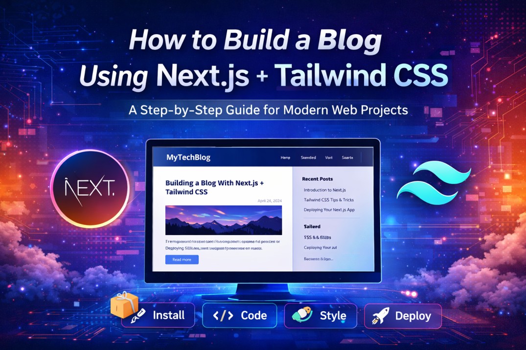
It has never been easier to create a modern, fast and SEO-optimized blog than with Next JS combined with Tailwind CSS. Next JS enables features that enable you to build your blog with Server–Side Rendering (SSR) and Static Site Generation (SSG) along with rapid UI layout development using Tailwind CSS to assist you in developing beautiful user interfaces.
By following this step–by–step guide you will be able to create a fully functioning blog from scratch using Next JS as the back–end application framework along with Tailwind CSS as both the design and layout library. This tutorial will help anyone from new to experienced developers create a blog that is scalable and high-performing.
Why You Should Use Next JS + Tailwind CSS?
There are many reasons why Next JS combined with Tailwind CSS has become a popular choice among web developers in 2026.
They include:
- Fast Static Generation
- Fast User Interface Creation Using Tailwind Utility Classes
- SEO–Friendly (Built–In SEO Optimization)
- Design Is Responsive By Default
- Simple To Deploy To Platforms Such As Vercel
Step 1: Create A New Next Js Application
Let‘s start by creating a new Next.js–based application. Follow the instructions given below.
To Install The Next Js Framework
npx create-next-app@latest my-blog
cd my-blog
npm run dev
Now launch your Web Browser and navigate to this URL:
http://localhost:3000
At this point, if everything has been set up correctly, your Next.js App should be running.
Step 2: Install Tailwind CSS
Next, the Tailwind CSS framework needs to be installed into your project.
Run this command:
npm install -D tailwindcss postcss autoprefixer
npx tailwindcss init -p
Configure Tailwind
Add the following code to tailwind.config.js:
/** @type {import('tailwindcss').Config} */
module.exports = {
content: [
"./pages/**/*.{js,ts,jsx,tsx}",
"./components/**/*.{js,ts,jsx,tsx}",
],
theme: {
extend: {},
},
plugins: [],
};
@tailwind base;
@tailwind components;
@tailwind utilities;
Step 3: Constructing the Blog Structure
/pages
index.js
/posts
[slug].js
/components
Header.js
PostCard.js
/content
blog1.md
blog2.md
Step 4: Including The Blog Content
Use markdown files to create your blogs!
---
title: "My First Blog"
date: "2026-01-01"
---
This is my first blog using Next.js and Tailwind CSS!
Step 5: Install A Markdown Parser Library
You will need to install a library that is able to read markdown files.
npm install gray-matter remark remark-html
Step 6: Find Blog Data
You will need a utility function in order to read the markdown file.
import fs from 'fs';
import path from 'path';
import matter from 'gray-matter';

const postsDirectory = path.join(process.cwd(), 'content');

export function getAllPosts() {
const fileNames = fs.readdirSync(postsDirectory);

return fileNames.map((fileName) => {
const slug = fileName.replace('.md', '');
const fullPath = path.join(postsDirectory, fileName);
const fileContents = fs.readFileSync(fullPath, 'utf8');
const { data } = matter(fileContents);

return {
slug,
...data,
};
});
}
Step 7: Render The Blog Posts
import { getAllPosts } from '../lib/posts';

export default function Home({ posts }) {
return (
<div className="p-6">
<h1 className="text-3xl font-bold mb-4">My Blog</h1>
{posts.map((post) => (
<div key={post.slug} className="mb-4">
<h2 className="text-xl font-semibold">{post.title}</h2>
<p>{post.date}</p>
</div>
))}
</div>
);
}

export async function getStaticProps() {
const posts = getAllPosts();
return { props: { posts } };
}
Step 8: Create Dynamic Blogs
import { getAllPosts } from '../../lib/posts';

export default function Post({ post }) {
return (
<div className="p-6">
<h1 className="text-2xl font-bold">{post.title}</h1>
<p>{post.date}</p>
</div>
);
}
Step 9: Style The Blog Using Tailwind CSS
 <div className="max-w-2xl mx-auto p-6">
<h1 className="text-4xl font-bold text-blue-600">
My Blog
</h1>
</div>
- No need for custom CSS
- Quick styling
- Fully responsive
Step 10: Add Header/Navigation Component
You can create all your header/navigation components in your header layout.
 export default function Header() {
return (
<header className="bg-gray-800 text-white p-4">
<h1 className="text-xl">My Blog</h1>
</header>
);
}
Step 11: Optimize Your Blog/Article For Search Engines
import Head from 'next/head';

<Head>
<title>My Blog</title>
<meta name="description" content="Next.js blog tutorial" />
</Head>
- Use proper heading structures (h1, h2)
- Add meta descriptions
- Optimize your images
- Clean URLs
Step 12: Deploy Your Blog
Now you can easily deploy your blog.
npm install -g vercel
vercel
Using Vercel, your blog will be live within minutes!
Real World Example
Before you would have a more traditional PHP blog that would be:
- slower to load
- harder to style
- less search engine optimized
After you have implemented Next.js (React) and Tailwind CSS you will have:
- a faster performing blog (SSG)
- a clean user interface
- an increase in your blog‘s search engine rankings
Best Practices for 2026
- Use Static Site Generation (SSG)
- Use Next.js Image component to optimize your images
- Create reusable components with Tailwind
- Keep your content in a markdown or CMS
- Enable caching for image and content files
Creating a Next.js blog with Tailwind CSS provides you with many advantages.
- Fast speed
- SEO ready format
- Stylish modern UI
- Expandable site design
The guide above serves as a great first step for building your own blog.
Time to build a blog!
- Create your Next.js app.
- Design using Tailwind CSS.
- Share your first post.
Do you want more ideas? You could try adding:
- Dark mode
- Comment feature
- Use a CMS system (Sanity, Contentful)