
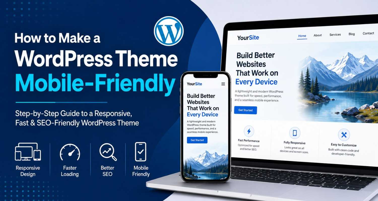
In this digital age, most people will open your site on their phones, tablets, and yeah, not really on desktop all the time. So if your WordPress website isn’t made to work nicely on mobile, visitors can bounce fast, and Google (and other search engines) might not like it as much, because of rankings.
In this guide you’ll learn how to make a WordPress theme mobile-friendly. We’ll cover responsive design approaches, practical optimization tips, and a bit of testing methods so you can be more confident before going live. Beginner or seasoned developer, you’ll still pick up useful improvements for user experience, SEO results, and speed.
Why Mobile-Friendly Design Matters (for real)
A mobile-friendly WordPress theme will auto adjust the structure, images, and content so it fits smaller screens without things looking cut off or cramped. This matters because:
* Google now relies on mobile-first indexing for ranking.
* People on mobile usually want pages that load quickly.
* Strong responsiveness usually boosts engagement.
* A smooth mobile experience can help conversions and sales.
If your pages look kinda broken on phones, users won’t fully trust your brand, no matter how good the content is.
1. Pick a Responsive WordPress Theme
First thing, choose a responsive theme. These modern themes usually shift layouts automatically based on screen size, without you manually doing everything.
Some well-known responsive WordPress themes are:
* Astra
* GeneratePress
* OceanWP
* Kadence
* Neve
Before installing, try the theme demo on your own phone. Like, actually open it, not just “eyeball it” on desktop.
What to Look for in a Responsive Theme
* Flexible layouts
* A mobile navigation menu that makes sense
* Good loading speed in practice
* Fonts that remain readable
* Images that scale correctly
2. Add the Viewport Meta Tag
The viewport meta tag basically tells mobile browsers how to scale your website properly.
Paste this inside the `<head>` area of your theme:
<meta name="viewport" content="width=device-width, initial-scale=1.0">
Why It’s Important
Without it, some mobile browsers show your site like it’s a tiny desktop page, zoomed out. Then users need to zoom in themselves, and that’s a bad time.
3. Use Responsive CSS Media Queries
Media queries let you apply different styles depending on screen width, height, or device behavior.
Simple example:
/* Desktop Design */
.container {
width: 1200px;
}

/* Mobile Design */
@media screen and (max-width: 768px) {
.container {
width: 100%;
padding: 15px;
}
}
What This Actually Does
* Removes rigid widths that break on small screens
* Adds breathing room using spacing
* Keeps layouts flexible instead of twitchy
Honestly, this is one of the biggest techniques for building a mobile-friendly WordPress theme.
4. Optimize Images for Mobile Screens
Big images are heavy. On mobile networks, that means slower pages, and slower pages = lower patience.
Responsive Image Best Practices
* Compress images before uploading
* Prefer WebP when possible
* Set `max-width: 100%`
* Turn on lazy loading
Example CSS:
img {
max-width: 100%;
height: auto;
}
Helpful Image Optimization Plugins
* Smush
* ShortPixel
* Imagify
These plugins compress images while trying not to ruin visual quality.
5. Upgrade Your Mobile Navigation
Menus designed for desktop can look messy on small screens. Usually, a hamburger menu or a collapsible navigation works better.
Example HTML:
<button class="menu-toggle">☰ Menu</button>
<nav class="mobile-menu">
<ul>
<li><a href="#">Home</a></li>
<li><a href="#">About</a></li>
<li><a href="#">Services</a></li>
</ul>
</nav>
Navigation Tips for Mobile
* Keep it simple
* Use buttons that are easy to touch (finger friendly)
* Avoid too many nested dropdowns
* Make tap targets obvious
When navigation is clean, the user journey feels smoother, and bounce rates often drop.
6. Make Fonts Mobile-Friendly (not tiny)
Tiny text causes zooming, squinting and frustration.
Recommended Font Sizes
* Body text: 16px minimum
* Headings: 24px–36px
* Button text: 14px–18px
Example:
body {
font-size: 16px;
line-height: 1.6;
}
Extra Typography Notes
* Choose readable fonts
* Give lines enough spacing
* Avoid huge wall-of-text paragraphs
Good typography keeps people reading longer, instead of bouncing away.
7. Improve Website Speed
Mobile visitors expect quick load times. A slow site hurts both SEO and user satisfaction.
Ways to Speed Things Up
Caching Plugins
Common options:
* WP Rocket
* LiteSpeed Cache
* W3 Total Cache
Minify CSS and JavaScript
Minification removes unnecessary parts so files shrink.
Enable Lazy Loading
Lazy loading delays images until they appear on screen while scrolling.
Use a CDN
A Content Delivery Network can improve global loading by serving files closer to the visitor.
Popular CDN choices:
* Cloudflare
* BunnyCDN
8. Avoid Popups That Ruin Mobile UX
Big popups can annoy people on phones, and they can negatively affect user experience as well as SEO signals.
Better Alternatives
* Smaller slide-ins
* Sticky banners
* Exit-intent popups (if used carefully)
Also, make sure the close button is easy to tap, not hidden behind tiny icons or awkward spacing.
9. Test Your Theme on Different Devices (don’t skip this)
Testing is essential before you officially launch. A theme can look perfect on one phone model, but glitch on another.
Devices to Test
* Android phones
* iPhones
* Tablets
* Multiple screen resolutions
Useful Tools for Testing
* Google Mobile-Friendly Test
* Chrome DevTools
* GTmetrix
* PageSpeed Insights
Quick Chrome DevTools Method
1. Open your site in Chrome
2. Right-click → Inspect
3. Tap the mobile device icon
4. Try different screen sizes and check the layout
This helps catch responsiveness problems quickly.
10. Use Responsive Page Builders (with control)
These modern page builders kind of make mobile optimization easier, way less stressful.
Recommended Builders
* Elementor
* Beaver Builder
* Bricks Builder
* Gutenberg
With them, you can customize your layouts separately for mobile , tablet , and desktop devices, sort of like giving each screen its own set of rules.
Example Features
* Padding that changes on mobile
* Typography that adapts
* Controls for what shows up on each device
* Columns that stay flexible
Common Mobile-Friendly Mistakes to Avoid
Try not to fall into these traps when designing your WordPress theme, because they can quietly ruin everything:
* Using layouts with fixed widths
* Uploading images that are way too big
* Clickable buttons that are too small, or cramped
* Font sizes that are hard to read
* Too many animations, like honestly, too much
* Plugins that aren’t optimized
Fixing those problems can improve mobile usability a lot, and faster than you’d expect.
SEO Benefits of a Mobile-Friendly WordPress Theme
A responsive site can boost:
* Google rankings
* User experience
* How long people stay, and not bouncing immediately
* Conversion rates
* Website speed scores
Google tends to prioritize mobile friendliness, which means responsiveness is basically a must for modern SEO now.
Making your WordPress theme mobile-friendly isn’t optional anymore. When your site responds well, you usually get better SEO, smoother user experience, and overall performance that feels more “clean”.
If you use responsive layouts, optimize your images, improve mobile navigation, and use faster-loading approaches, you’ll end up with a professional site that works across all screens, pretty seamlessly.
Start by testing your current theme on a few mobile devices. Then implement the changes from this guide gradually, one piece at a time.
Want to push your WordPress website even further? Start today by optimizing your site speed and applying responsive design techniques. A quicker, mobile-friendly website can raise traffic, support better rankings, and give every visitor a nicer experience.