

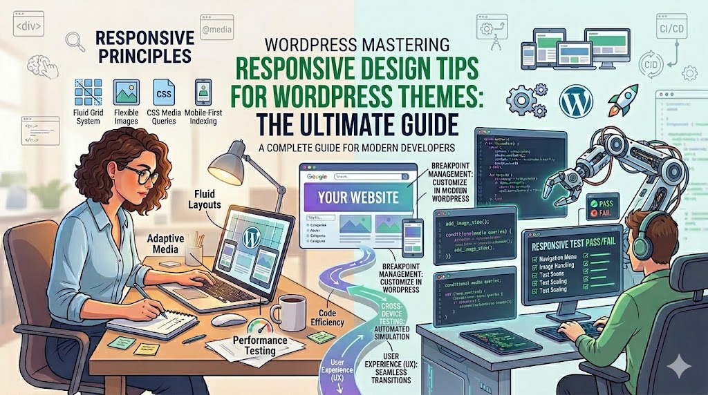
A WordPress site could look fantastic on your computer screen but utterly disastrous on your smartphone. Small text, broken layouts, large images, and unclickable buttons remain commonplace, even as we move towards 2026.
This is precisely why responsive design is so crucial.
In today’s world, most of the traffic on the web happens through smartphones, while Google also gives preference to websites that are usable via mobile phones in its ranking algorithm. Not only will you ruin the user experience, but you will also hurt the SEO, conversions, and engagement rate.
In this article, you will get practical and easy to implement responsive design advice for your WordPress theme.
What Is Responsive Design in WordPress?
Responsive design means your website automatically adapts to different screen sizes and devices.
A responsive WordPress theme should:
- Adjust layouts dynamically
- Resize images properly
- Keep navigation usable
- Maintain readability on smaller screens
* The goal is simple: your website should feel easy to use everywhere.
Why Responsive Design Matters More Than Ever
In 2026, users expect websites to work flawlessly on:
- Smartphones
- Tablets
- Laptops
- Large desktop screens
A non-responsive website often leads to:
- Higher bounce rates
- Lower conversions
- Poor SEO rankings
- Frustrated users
Google also uses mobile-first indexing, meaning:
* The mobile version of your website is now the primary version Google evaluates.
Tip 1: Choose a Lightweight Responsive Theme
Everything starts with your WordPress theme.
Some themes claim to be “mobile-friendly” but still include:
- Bloated page builders
- Heavy animations
- Poor mobile spacing
- Slow-loading assets
Look for themes that prioritize:
- Speed
- Clean code
- Flexible layouts
- Mobile responsiveness
* Simpler themes often perform far better long term.
Tip 2: Design Mobile-First
Many beginners build their website for desktop first and then try fixing mobile later.
That approach usually creates problems.
Instead:
Start designing for mobile screens first.
Why?
Because mobile constraints force you to:
- Simplify layouts
- Prioritize important content
- Improve usability
* Good mobile design usually improves desktop design too.
Tip 3: Use Flexible Layouts Instead of Fixed Widths
One of the biggest responsive design mistakes is using fixed-width containers.
Bad Example:
.container {
  width: 1200px;
}
This can break layouts on smaller devices.
Better Example:
.container {
  width: 100%;
  max-width: 1200px;
  margin: auto;
}
* Flexible layouts adapt naturally across devices.
Tip 4: Use CSS Media Queries Properly
Media queries allow your design to respond to screen size changes.
Example:
@media (max-width: 768px) {
  .header-menu {
    flex-direction: column;
  }
}
This changes navigation layout on smaller screens.
Common breakpoints:
- 1200px → desktops
- 992px → laptops
- 768px → tablets
- 480px → smartphones
* Media queries are the foundation of responsive web design.
Tip 5: Optimize Typography for Mobile Devices
Responsive typography is often ignored.
Tiny text creates terrible readability.
Best practices:
- Use scalable font sizes
- Increase line spacing
- Avoid long paragraphs
Example:
body {
  font-size: 1rem;
  line-height: 1.7;
}
* Readability directly affects user engagement.
Tip 6: Make Navigation Mobile-Friendly
Desktop menus rarely work well on mobile screens.
Better mobile navigation options:
- Hamburger menus
- Sticky headers
- Simplified navigation links
* Users should find important pages quickly without frustration.
Tip 7: Optimize Images for Responsive Layouts
Oversized images are one of the biggest causes of slow mobile websites.
Use:
- WebP image format
- Responsive image sizes
- Lazy loading
Example:
<img src="banner.webp" loading="lazy" alt="responsive banner">
* Faster images improve both UX and SEO.
Tip 8: Avoid Overusing Animations
Animations can look impressive—but excessive animations hurt performance on mobile devices.
Problems caused by heavy animations:
- Slower loading
- Increased CPU usage
- Poor mobile usability
* Use subtle animations only where they genuinely improve UX.
Tip 9: Use Relative Units Instead of Pixels
Fixed pixel values create rigid layouts.
Better responsive units:
%rememvwvh
Example:
h1 {
  font-size: 2.5rem;
}
* Relative units scale more naturally across devices.
Tip 10: Test Your Theme on Real Devices
A responsive preview inside WordPress isn’t enough.
Always test on:
- iPhones
- Android devices
- Tablets
- Different browsers
* Real-device testing reveals issues simulators often miss.
Tip 11: Optimize Mobile Performance
Responsive design is not only about layouts—it’s also about speed.
Mobile users expect:
- Fast loading
- Smooth scrolling
- Lightweight pages
Improve speed by:
- Compressing images
- Using caching plugins
- Reducing unnecessary scripts
- Minimizing plugin usage
* Performance is part of responsive design.
Tip 12: Keep Forms Simple on Mobile
Long forms are frustrating on small screens.
Mobile-friendly forms should:
- Use fewer fields
- Have large input areas
- Include proper spacing
Example:
<input type="email" placeholder="Enter your email">
* Simpler forms improve conversion rates significantly.
Tip 13: Use Responsive Grids
Grid systems help layouts adapt cleanly.
Example:
.grid {
  display: grid;
  grid-template-columns: repeat(auto-fit, minmax(250px, 1fr));
}
* Responsive grids reduce layout breakage.
Common Responsive Design Mistakes
a. Ignoring Tablet Layouts
Many sites look fine on phones and desktops—but awkward on tablets.
b. Oversized Popups
Mobile popups can completely ruin UX.
c. Tiny Buttons
Buttons should be easy to tap with fingers.
d. Too Many Columns
Complex layouts rarely work well on mobile.
e. Desktop-Only Thinking
Users interact differently on touch devices.
Real-World Example
Before Responsive Optimization:
- Small unreadable text
- Broken mobile menu
- Slow image loading
- High bounce rate
After Optimization:
- Better readability
- Faster performance
- Improved mobile engagement
- Lower bounce rates
* Small responsive changes often create major UX improvements.
Responsive Design and SEO
Responsive websites help improve:
- Mobile usability scores
- Core Web Vitals
- Search rankings
- User engagement
Google prioritizes websites that deliver smooth mobile experiences.
* Better UX often leads to better SEO performance naturally.
Responsive Design Tools Worth Using
Helpful tools include:
- Browser developer tools
- Google PageSpeed Insights
- Mobile-Friendly Test tools
- Responsive preview extensions
* Testing regularly helps catch layout issues early.
FAQ
What makes a WordPress theme responsive?
A responsive theme automatically adapts layouts, images, and navigation to fit different screen sizes.
Why is responsive design important for SEO?
Google uses mobile-first indexing, so responsive websites generally perform better in search rankings.
Can responsive design improve conversions?
Yes. Better usability and faster mobile experiences often increase engagement and form submissions.
Summary
Responsive design is no longer optional for WordPress websites in 2026.
The key principles are:
- Mobile-first design
- Flexible layouts
- Optimized images
- Better typography
- Fast performance
* A responsive website creates better experiences for both users and search engines.
Take the Next Step
Start reviewing your WordPress website today:
- Test it on multiple devices
- Fix layout issues on mobile
- Optimize images and performance
- Simplify navigation and forms
👉 Even small responsive improvements can dramatically improve SEO, usability, and conversions.
Build a faster, cleaner, and fully responsive WordPress website in 2026 that users actually enjoy using